Performing a prediction of a continuous y target using Keras, the simple structure of the code revolves around;
model = Sequential()
model.add(Dense(200, input_dim=15, activation= "relu"))
model.add(Dense(750, activation= "relu"))
model.add(Dense(500, activation= "relu"))
model.add(Dense(750, activation= "relu"))
model.add(Dense(500, activation= "relu"))
model.add(Dense(200, activation= "relu"))
model.add(Dense(100, activation= "relu"))
model.add(Dense(50, activation= "relu"))
model.add(Dense(1))

model.compile(loss= 'mse' , optimizer='adam', metrics=['mse','mae'])
history=model.fit(X_train, y_train, batch_size=50,  epochs=150,
                  verbose=1, validation_split=0.2)
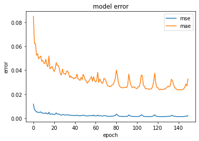
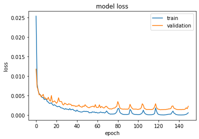
This has resulted in the following metric chart;
What might be causing these, and how to eliminate (or greatly reduce) them?
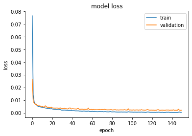
UPDATE: Just reduced the learning rate to 0.0001 per Neil Slater's suggestion, and the loss curve may have had the spikes reduced, though the scale of the graph has changed. The training loss has increased from 0.00007 to 0.00037, the validation loss from 0.0014 to 0.002, and the prediction error increased from 0.037 to 0.046.
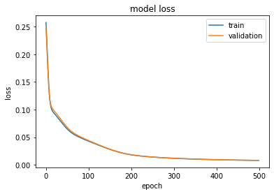
I then changed epsilon from it's value of 1e-07 to 0.1 and increased the epochs from 150 to 500. The validation loss increased to 0.0082 and the prediction error increased to 0.093, with the corresponding model loss shown below.
While not an overall improvement at either step, this did remove the spikes as I requested, hence Neil's advice gives me additional considerations to explore and measure within the Adam optimizer (along with other optimizers), so I consider this to have been an important learning experience. One such exploration uncovered this more detailed explanation of optimizers than I had been exposed to before, as well as this 3D visualization of loss topologies and the effect differing optimizers and parameters have on finding the optimal minima (keep a sharp eye on the options being chosen in the upper right corner).


